Alberich Potter
關於我
| 名稱 | Alberich Potter |
|---|---|
| 地點 | England |
| 加入日期 | July 2, 2010 |
| 參與開發的附加元件數量 | 503 佈景主題 |
| 此開發者的附加元件平均分數 | 評分: 4 / 5 顆星 |


我所發表的評論
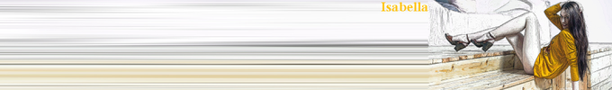
KU Jayhawk black
評分: 4 / 5 顆星
I like it, even though I have no affiliations with the University of Kansas!
Bicentenario
評分: 3 / 5 顆星
Good colour scheme but the lettering needs to be smaller so that you don't need so many rows of additional blank toolbars to see it all.
Plain Gyrados
評分: 3 / 5 顆星
I like the dragon but feel that a little colour to the background would be beneficial.
Smoothy
評分: 1 / 5 顆星
I'm sorry, but I really don't get this. It's not a theme, persona, wallpaper, background, or whatever other term you might want to use to describe it, it's just a block of plain grey, the most boring colour known to mankind!
FirstPersonaByRichardS
評分: 4 / 5 顆星
I do quite like plain, simple themes, and this certainly falls into that category. Wonder why you never chose to create any more after this?
Thanksgiving 10 by MaDonna
評分: 4 / 5 顆星
Love the autumn colours, or fall colors in American! A darker background would make it better for me, but that's just personal preference.
P.S. Having started to test the water with some of my own wallpapers I've given up complaining about additional rows of blank toolbars because I've come to realise how difficult it is to create a decent looking one that doesn't require at least one extra row!
osis 16 mlg
評分: 3 / 5 顆星
Not bad, and I like the green textured background. But the text needs to be below or to the left of the image so that the number of rows of additional blank toolbars required can be reduced.
Firefox Kilates
評分: 4 / 5 顆星
I really like the golden colour scheme, not so keen on the text. And I've no idea what Kilates means!
Rainbow Light Shapes
評分: 5 / 5 顆星
Excellent. Reminds me of Spirograph from my childhood, only we were never given black paper at school!
Serenity Chapel
評分: 5 / 5 顆星
Beautiful. Just the thing to make me feel cooler during the greatest UK heatwave since 1976!
Germany Fahne
評分: 4 / 5 顆星
I love the vibrant colours of the German flag, but my dilemma with this is whether to have sufficient rows of additional toolbars in order to get some of the yellow band on screen. In the end I decided not too, but that's just a personal choice which doesn't detract from the theme. Maybe you should have yellow as the footer instead of black?
Green Ornate Abstract Design
評分: 3 / 5 顆星
Just a little too much contrast between the very bright centre and the black right for my preference.
Dont call Me Deejay
評分: 2 / 5 顆星
More like "Don't call me full stop!" Sorry, but this is ghastly; garish colour scheme, oversized text and no bottom bar. Definitely not for me.
Spots n stars
評分: 5 / 5 顆星
Excellent, simple but effective theme, which doesn't interfere with icons and menu buttons and with no need for additional blank toolbars.
Naruto NinjaArt Jutsu
評分: 3 / 5 顆星
It doesn't do a great deal for me, but it's well executed.
As an aside, I used to whinge endlessly about how many of these themes needed too many extra rows of blank toolbars to see them properly, and this falls into that category; but since I have started creating my own themes I've realised how difficult it is not to fall into that trap!
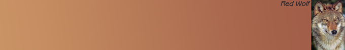
okitsaws
評分: 3 / 5 顆星
I'm not normally a fan of themes with large text, but this one seems to work OK and I really like the yellow background.
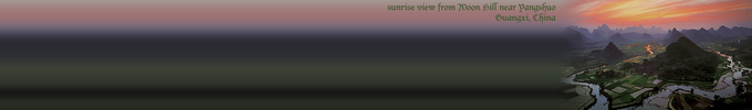
Planet Earth NASA
評分: 2 / 5 顆星
As a photograph of the Earth from space I have to say I find it very disappointing. OK as an unobtrusive background.
如果您要新增自己的收藏集,你必須先申請一個 Mozilla 附加元件的帳號。