Willkommen bei den Thunderbird-Add-ons.
Fügen Sie Zusatzfunktionen und Stile hinzu, um sich Thunderbird zu Eigen zu machen.
SchließenAlberich Potter
Über mich
| Name | Alberich Potter |
|---|---|
| Ort | England |
| Benutzer seit | Juli 2, 2010 |
| Anzahl der entwickelten Add-ons | 503 Themes |
| Durchschnittliche Bewertung der Add-ons des Entwicklers | Bewertet mit 4 von 5 Sternen |


Meine Bewertungen
EarthRise over the Moon 2
Bewertet mit 5 von 5 Sternen
Outstanding. Great photo, uncluttered background and the Earth not obscuring any of the icons on my toolbars.
Raspberry Dreams
Bewertet mit 4 von 5 Sternen
Don't know where the ridiculous and pretentious title comes from (where are the raspberries, or is this what raspberries dream of!?!) but it does make for a simple, clean background over which all my icons are completely visible, which is always my first priority.
Redskins2015
Bewertet mit 4 von 5 Sternen
Not a fan of American Football but this makes for a good, clear background for my toolbars.
Giraffe of the Serengeti
Bewertet mit 2 von 5 Sternen
Could have been really good - nice plain background, giraffe head doesn't obscure the icons. But unless you have 5/6 rows of menu/toolbars at the top of your Firefox you only get half or less of said giraffe's head!
Adore the Yellow Roses
Bewertet mit 5 von 5 Sternen
Beautiful, colourful background that still allows perfect clarity of the toolbars.
JPN Ghost Kohada_Koheiji
Bewertet mit 2 von 5 Sternen
Like the predominantly black background but the interesting-looking character top right is where all my toolbar icons reside and doesn't help with visibility.
Outer Space Swirl
Bewertet mit 5 von 5 Sternen
Great psychedlic style background that doesn't obscure the icons on the toolbar.
tronic
Bewertet mit 2 von 5 Sternen
Interesting looking character but makes for a really poor background to a toolbar of predominantly black/grey/white icons.
Light Purple Butterflies
Bewertet mit 4 von 5 Sternen
I like it it. Although the butterflies are not that well defined against the speckled background the colours are such that I can see all my icons without difficulty.
Jack Frost
Bewertet mit 3 von 5 Sternen
Nice simple design but the white Jack Frost conflicts horribly with the predominantly white icons on the top right of my toolbars.
Love Sucks Damon
Bewertet mit 2 von 5 Sternen
Too dark and too much going on on the right hand side. Simpler is better.
MyCalla
Bewertet mit 3 von 5 Sternen
In general not bad. Icons still fully visible on toolbar and not bad levels of colour contrast.
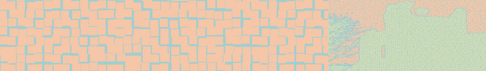
Cool Blue Theme
Bewertet mit 3 von 5 Sternen
More like boring blue theme!
But at least you can actually see the icons on the toolbars properly.
Um Ihre eigenen Sammlungen zu erstellen, müssen Sie einen Benutzeraccount bei Mozilla Add-ons haben.