Добро пожаловать в дополнения Thunderbird.
Добавляйте дополнительные функции и стили, чтобы настроить Thunderbird по своему вкусу.
ЗакрытьAlberich Potter
Обо мне
| Имя | Alberich Potter |
|---|---|
| Местонахождение | England |
| Пользователь с | Июль 2, 2010 |
| Число разработанных дополнений | 503 темы |
| Средний рейтинг дополнений разработчика | Рейтинг 4 из 5 звёзд |


Мои отзывы
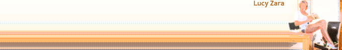
Chanel Madamoiselle Blake Lively
Рейтинг 3 из 5 звёзд
Atmospheric theme somewhat spoiled by the fact that the top of Blake Lively's head has been cropped off.
amor escrito
Рейтинг 4 из 5 звёзд
I love writing too (assuming my translation is correct) but I would say this is more like a doodle. Nevertheless it makes for a good theme.
Fleur Vintage10
Рейтинг 3 из 5 звёзд
Today's random selection, and quite attractive in its own way, but not really my cup of tea.
Gooby pls
Рейтинг 1 из 5 звёзд
It's not often these days that I criticise a theme for needing too many additional rows of blank toolbars to see it properly because, having started creating my own, I realise how difficult it is to concentrate the important parts of the image into the top third of the allowed 200 pixels, but this is one instance where that criticism is justified. The character is far too big and I need 6 additional rows to see it all, and am then left with a massive wall of empty white space at the top of my screen. And I'm not sure what Gooby pls is meant to be; it looks like a badly drawn Donald Duck to me!
Spring Rest
Рейтинг 4 из 5 звёзд
Mmmm....think I'll forget about my computer today and go and sit in the garden with a good book! Your usual high standard.
ARABIAN EYES RED WAVE
Рейтинг 4 из 5 звёзд
Stunningly beautiful eyes and a great colour scheme. The cropping around the eyes, however, is a little too severe, with the top of her left eyelid missing, which leads me to deduct one star.
SK Kitty Clouds
Рейтинг 4 из 5 звёзд
Simple attractive theme, good-looking cat. I wonder what's it's spotted in the sky that I can't see?
Romance On The Moonlight
Рейтинг 2 из 5 звёзд
Nice idea but extremely poor execution with badly blurred and noisy image quality.
Random spiral
Рейтинг 4 из 5 звёзд
Simple but with an attractive colour scheme. Pity you haven't tried creating any more since.
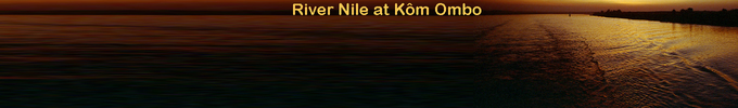
boatman and river
Рейтинг 2 из 5 звёзд
I love the image but not at all keen on it being repeated and mirrored and with that gap between. The other problem is that the key part of the picture - the boatman - is at the bottom, necessitating lots of additional toolbars in order to be able to see it.
Noelle Allen
Рейтинг 2 из 5 звёзд
Black and white abstract themes don't really work for me; I find it a bit of a mess if I'm being honest.
HanChul
Рейтинг 2 из 5 звёзд
Sometimes I really regret choosing my themes on an entirely random basis; today is such a day! Definitely not for me, although I do quite like the monochrome colour scheme.
Armata 1989 AC MILAN
Рейтинг 2 из 5 звёзд
I have no strong feelings either way about AC Milan, but I find this theme to be much too busy and cluttered.
Spring Vines
Рейтинг 4 из 5 звёзд
I'm not normally a big fan of cartoon type themes, but this is simple, non-intrusive, fresh and attractive. Your usual high standard.
Athelde
Рейтинг 4 из 5 звёзд
Attractive, non-intrusive colour scheme. The bright parts are just a little too bright for my taste, but by using my preferred configuration of only one additional blank toolbar row these are hidden.
TKMN AKB
Рейтинг 3 из 5 звёзд
I have to confess that it doesn't really appeal to me; just too much black and too little other content.
Support Outlaws-1
Рейтинг 4 из 5 звёзд
Good, simple theme and colour scheme. For my display set up the font size could do with being a point or two lower as the S of Support overlaps two of my toolbar icons, but it's not a major problem as I can still see them.
Для создания своих подборок вам необходимо иметь учётную запись на сайте дополнений Mozilla.