Bem-vindo as Extensões para o SeaMonkey.
Adicione recursos e estilos extras para tornar o SeaMonkey só seu.
FecharAlberich Potter
Sobre mim
| Nome | Alberich Potter |
|---|---|
| Localização | England |
| Usuário desde | Julho 2, 2010 |
| Número de extensões desenvolvidas | 182 temas |
| Avaliação média das extensões do desenvolvedor | Avaliado em 5 de 5 estrelas |


Minhas análises
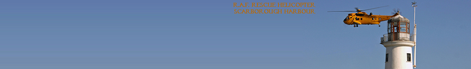
Support Outlaws-1
Avaliado em 4 de 5 estrelas
Good, simple theme and colour scheme. For my display set up the font size could do with being a point or two lower as the S of Support overlaps two of my toolbar icons, but it's not a major problem as I can still see them.
Firefox Kilates
Avaliado em 4 de 5 estrelas
I really like the golden colour scheme, not so keen on the text. And I've no idea what Kilates means!
batman shil
Avaliado em 4 de 5 estrelas
Looks like Batman in a Victorian London pea-souper! And I don't get what that thing sticking out of his back is?. Needs one additional blank toolbar row to see the eye slits, which I'm never too happy about, but otherwise not a bad, subtle, non-intrusive theme.
I Like Dortmund
Avaliado em 4 de 5 estrelas
Not a fan of Borussia Dortmund, or of any team in particular other than my local team - the mighty Cobblers! - but this makes for a decent, simple but effective background. My only quibble is that the text could be a little higher up so that I don't need 2 additional rows of blank toolbars in order to see it all.
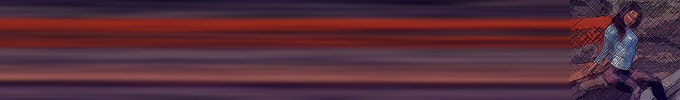
A Southern Heart-Donica Knight
Avaliado em 3 de 5 estrelas
I've no knowledge of her or her music but she's a good looking woman.
Pity I needed 2 rows of additional blank toolbars to see all her face on the images, and the light colours of the background tend to clash with my icons, menu buttons and text of the same colour.
Gimperiano
Avaliado em 4 de 5 estrelas
A simple, attractive theme that only needed one additional blank toolbar row and doesn't clash with my icons and menu buttons; although I can't say I'm entirely comfortable having the word "gimp" emblazoned on the top of my browser!
LIDSNOW7
Avaliado em 2 de 5 estrelas
Not sure about the purple colour, and there's also a lot of colour noise.
night uzor by levscaya
Avaliado em 5 de 5 estrelas
Brilliant! Reminds me of the kind of patterns you could create with a Spirograph in the Sixties - except that we never had access to black paper and silver pens as kids in those days! Doesn't obscure or clash with any of my icons and menu buttons and doesn't need row upon row of additional blank toolbars to get the effect.
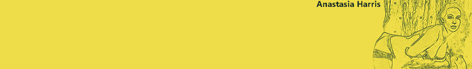
Swans and Dolphins b MaDonna
Avaliado em 3 de 5 estrelas
Not my favourite MaDonna theme it has to be said, and it's probably the first time I've rated one less than 4 stars.
For me the white swans on the pale blue and white water and sky lacks contrast, and the smaller of the dolphins is mostly obscured by my search bar.
I also can't recall ever seeing swans and dolphins swimming together in real life!☺
Under Sea Water
Avaliado em 3 de 5 estrelas
Well it's blue - and the sea is generally perceived to be that colour - but this doesn't really conjure up any images of the sea for me. But at least I can get rid of all the unnecessary extra toolbars again without ruining the effect.
Colores 15
Avaliado em 2 de 5 estrelas
Not quite the hideous mess I was expecting from the preview, but a garish mess of colour nonetheless. But at least it doesn't require more than 4 rows of toolbars to get the full effect, or obscure any my icons and menu buttons; the usual bugbears of the majority of themes.
Dark abstract art
Avaliado em 3 de 5 estrelas
I like the simplicity and that it doesn't require more than 4 rows of toolbars to get the full effect, but the dark grey colour renders some of my menu buttons and icons a little difficult to see.
Achievement Hunter - RoosterTeeth
Avaliado em 3 de 5 estrelas
I have a couple of rubber stamps in my desk drawer at work, but I would hardly lay claim to that being an achievement!
It's a decent enough background but unfortunately falls into the all too common trap of needing more than 4 rows of toolbars in order to see the full image.
Benben
Avaliado em 1 de 5 estrelas
When I saw the preview I quite liked it, but once installed all I have is a black background. On my 4-row toolbar all I can see of the character is the grey squiggle of the tail and two darker grey shadows that are the tops of the ears.
COLOUR FRACTAL
Avaliado em 3 de 5 estrelas
Good colours make for a pleasing toolbar background that is not dependent on the number of rows in your toolbar and which doesn't obscure any of the icons.
But this is NOT a fractal!
Dad holds up babys Life
Avaliado em 2 de 5 estrelas
I know it's not Father's Day but this was my random selection for today. Works OK as a theme but definitely not my cup of tea - too cute and I don't like kids!
Ferrari LaFerrari F150
Avaliado em 3 de 5 estrelas
Fabulous car but doesn't quite make the grade as a background. Although you've avoided the main pitfall with most themes in that you've made an effort to keep the main images at the top, the very bottom of the car is cropped on my 4-row toolbar. I also find the left hand side, where some of my main icons reside, to be a bit messy.
Carbon Pro
Avaliado em 4 de 5 estrelas
Well it's certainly minimalist! But it does meet all the main criteria for me for a good theme - it doesn't require 6 rows of toolbars to see the full effect, it doesn't obscure any of the icons on said toolbars and it works well with any screen resolution.
Outer Space Swirl
Avaliado em 5 de 5 estrelas
Great psychedlic style background that doesn't obscure the icons on the toolbar.
tronic
Avaliado em 2 de 5 estrelas
Interesting looking character but makes for a really poor background to a toolbar of predominantly black/grey/white icons.
Para criar as suas próprias coleções, você deve ter uma conta no Mozilla Add-ons.