Alberich Potter
About me
| Name | Alberich Potter |
|---|---|
| Location | England |
| User since | July 2, 2010 |
| Number of add-ons developed | 503 themes |
| Average rating of developer's add-ons | Rated 4 out of 5 stars |

My Reviews
Zespri
Rated 3 out of 5 stars
Nice, fresh colour scheme but the address bar at the top ruins it for me.
zebra&stars
Rated 1 out of 5 stars
What a ghastly mess - it looks like the aftermath of a make-up explosion in a pre-pubescent girl's bedroom! But at least I didn't have to add any additional rows of blank toolbars to see it all - because the less I can see of it the better!
Foxblue
Rated 4 out of 5 stars
Good, simple background that doesn't need more than one row of additional blank toolbars, unless you're desperate to see the text as well, and doesn't clash with icons and menu buttons.
Exo & Bts <3
Rated 2 out of 5 stars
Purely black and white themes don't really work, at least not with my layout. The BTS logo clashes horribly with some of my icons and the text is all but obscured by my address bar
ANIMATED GOLDEN SPRINKLES
Rated 4 out of 5 stars
Lovely pastel shaded background. Doesn't need lots of additional rows of toolbars but the pale nature of it does clash a little with my icons on the right. And not entirely convinced of the merits of the animation, but at least it's not too distracting.
Kingdom Hearts Kairi and Xion
Rated 2 out of 5 stars
Good, simple monochrome background. But just not keen on the fact that it needs 4 rows of additional blank toolbars to see all the faces; settled for only one, just to have the eyes.
Hayate no gotoku_knock knock
Rated 2 out of 5 stars
Definitely a case of less is more - this is much too busy to make an effective background. But at least I only needed one additional row of blank toolbar to see all the heads and, despite the wide variety of colour, it surprisingly doesn't clash with icons and menu buttons.
Skateboarding Logos
Rated 2 out of 5 stars
Too busy and disjointed, and needs too many rows of additional blank toolbars to see it all, so I didn't bother with any.
Camping Minds
Rated 1 out of 5 stars
Not sure why I would want to have 3 rows of additional blank toolbars to further bloat my Firefox architecture in order to be able to fully see half of a corporate tagline that I don't care about. The quality of the text is poor and fuzzy, and although the background looks as if it might be of interest, it is too dark to be really able to see what it consists of.
asya123
Rated 2 out of 5 stars
You've squashed her head vertically yet it still needs 5 rows of additional blank toolbars to see it all. Hating to waste so much web page space at the expense of Firefox architecture I've reduced to two and just get the eyes and nose and all of the word Madonna. I like the interlocking pattern centre right but it would be better if it stretched all the way across in place of plain white space.
Muro de Ladrillos
Rated 4 out of 5 stars
Great in that it doesn't need any additional rows of blank toolbars to get the full effect, not so great in that the colour of the cement clashes with many of my icons of almost the same colour. Overall though a very good, simple but effective theme.
batman shil
Rated 4 out of 5 stars
Looks like Batman in a Victorian London pea-souper! And I don't get what that thing sticking out of his back is?. Needs one additional blank toolbar row to see the eye slits, which I'm never too happy about, but otherwise not a bad, subtle, non-intrusive theme.
Robots and Monsters
Rated 3 out of 5 stars
Can't comment on the band, although I doubt that they are my cup of tea. Theme is OK apart from the white text of the band name, which is too bright and clashes with some of my icons, and needs 2 rows of additional blank toolbars to see, which is always a negative in my book.
Starbreeze
Rated 4 out of 5 stars
Attractive grey theme (not often I find myself writing that!) and regal looking cat. My only criticism is that it needs 3 rows of additional blank toolbars in order to see all of the cat's head.
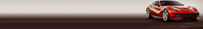
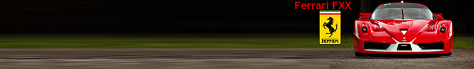
Opel GT 2006-2009
Rated 4 out of 5 stars
Not that I'm a big fan of the car, but a theme that doesn't need additional rows of toolbars to see the key points of the image is always a big plus in my book. Does conflict a little with icons and icons but enough to render them invisible.
nansky
Rated 2 out of 5 stars
I never find that predominantly black and white themes work very well - there's too much contrast, which tends to clash with icons and menu buttons. And it needs at least 4 rows of additional blank toolbars to see most of the image, which is a complete waste of valuable web page space; I therefore choose to have none and can just see the eyes and the top of the script.
A Happy Snowman by MaDonna
Rated 4 out of 5 stars
Think he must be enjoying the spring sunshine....but not for long! A high class theme, as always, and quite happy to have the two extra rows of blank toolbars required to see all of his smiling face and the doughnuts!
dwell in possibility
Rated 4 out of 5 stars
Attractive background that doesn't clash with icons or menu buttons and doesn't need additional rows of blank toolbars. Would be better without the text!
Apple TV
Rated 3 out of 5 stars
Looks like a plain and simple pink to turquoise gradient to me. Relatively pleasing on the eye, doesn't clash with anything and doesn't need lots of rows of additional toolbars.
To create your own collections, you must have a Mozilla Add-ons account.